
A little wild.
A lot of golden.
Warm glass. Loud color. A chunky wordmark with a soft spot for the sweet stuff.
The marks.
One expressive wordmark, a compact seal, and a bloom that does a little of the talking. The primary master follows the label lettering, so packaging and the website belong to the same world.


Keep at least one flower-petal width around the primary mark. Minimum digital wordmark width: 100 px. Use one ink color with clear contrast; never stretch, outline or add a shadow. Use the transparent master for digital applications. Consult the full brand specification for print production.
Honey is golden.
The label gets loud.
Bricolage
Grotesque 800
Big personality. Short headlines. Tight, deliberate spacing.
The expressive display companion to the custom wordmark.
Instrument Sans.
Clear, friendly, useful.
400 for stories. 600 for actions.
Comfortable lines, natural sentence case, readable product details.
One jar. Three moods.
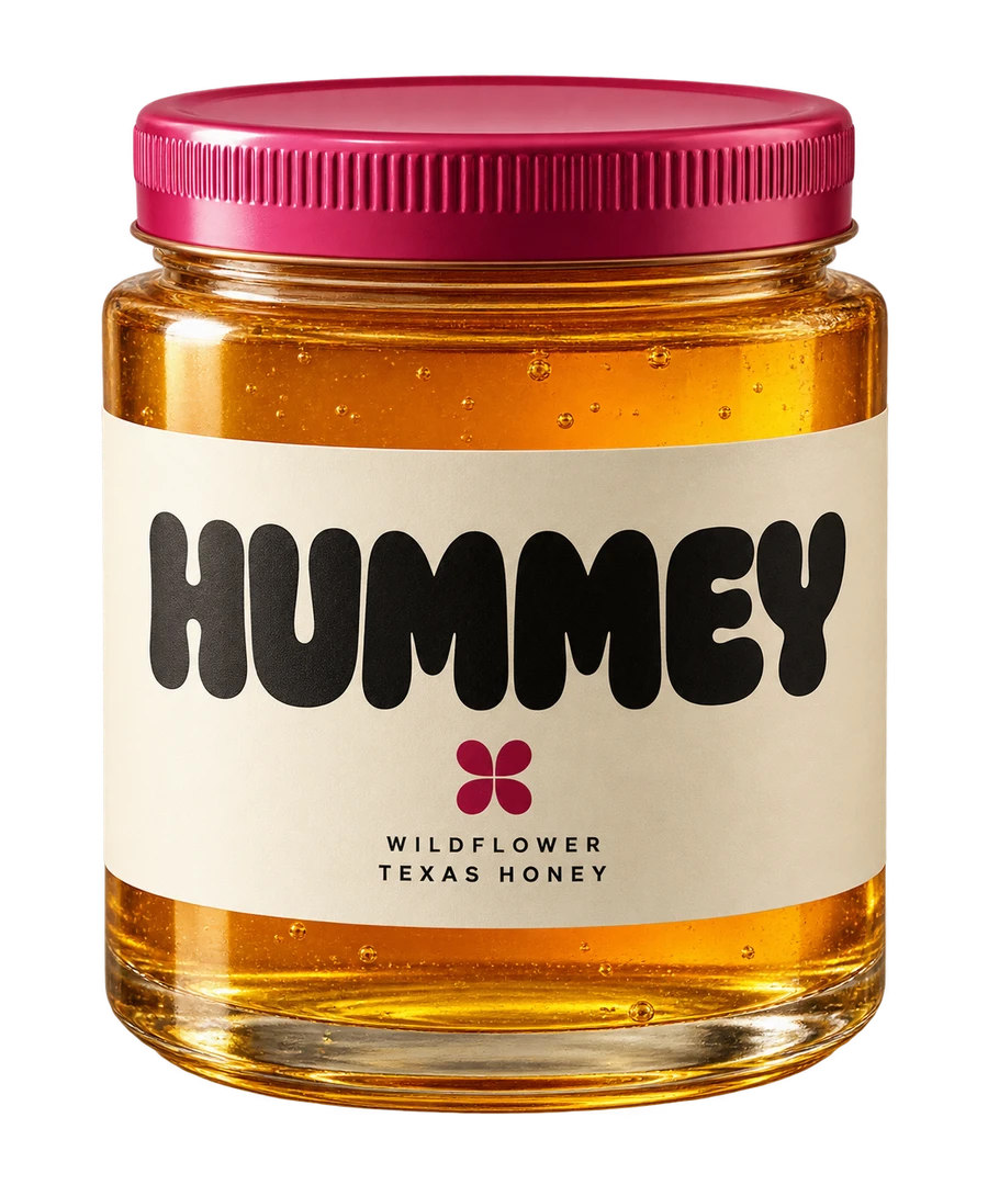
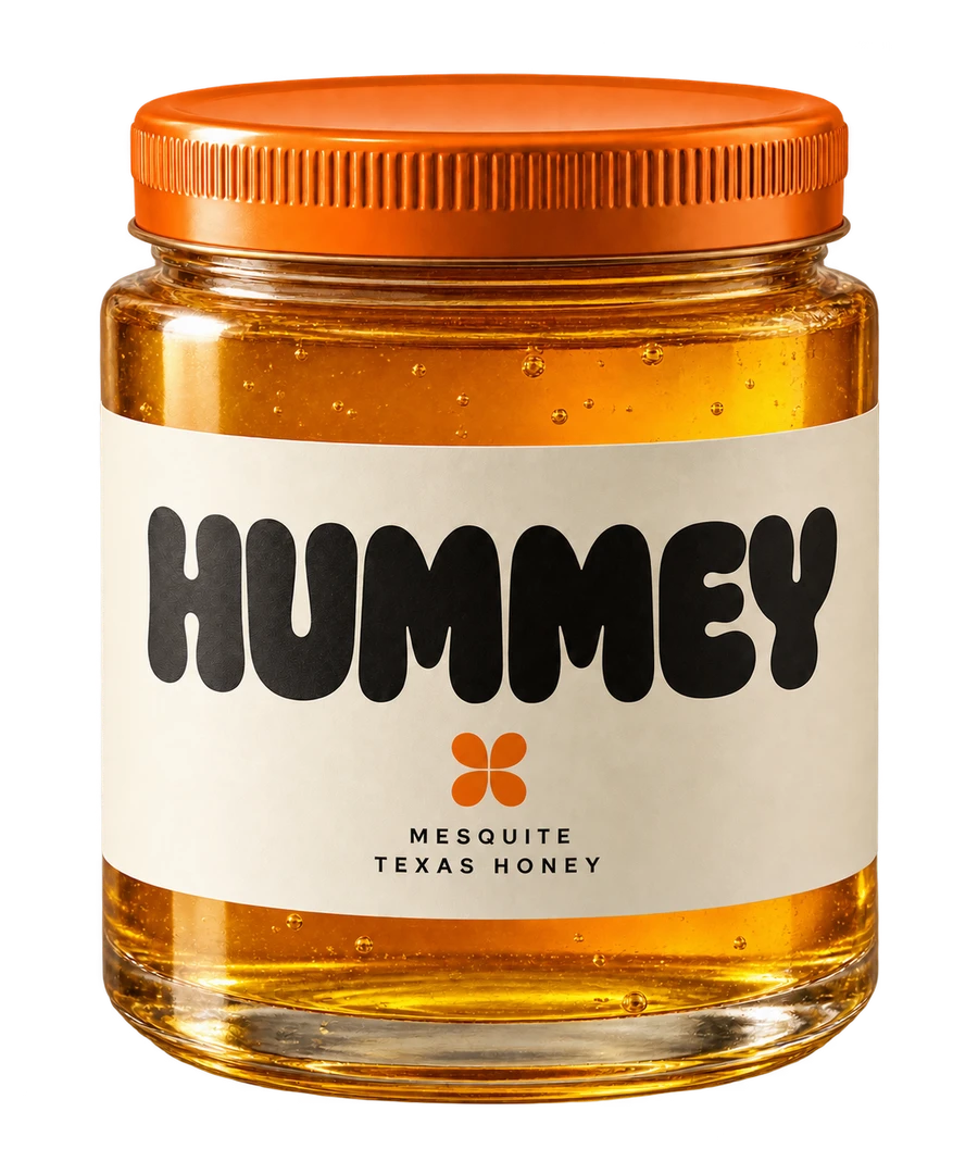
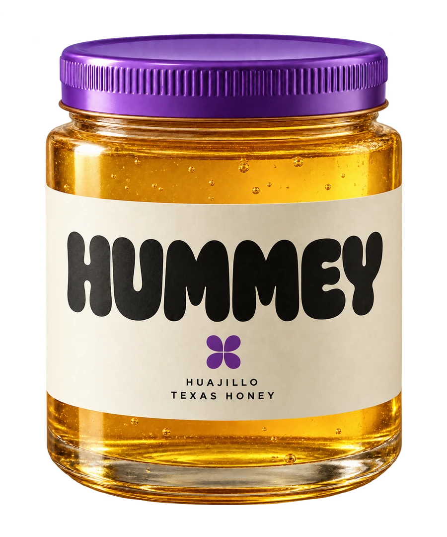
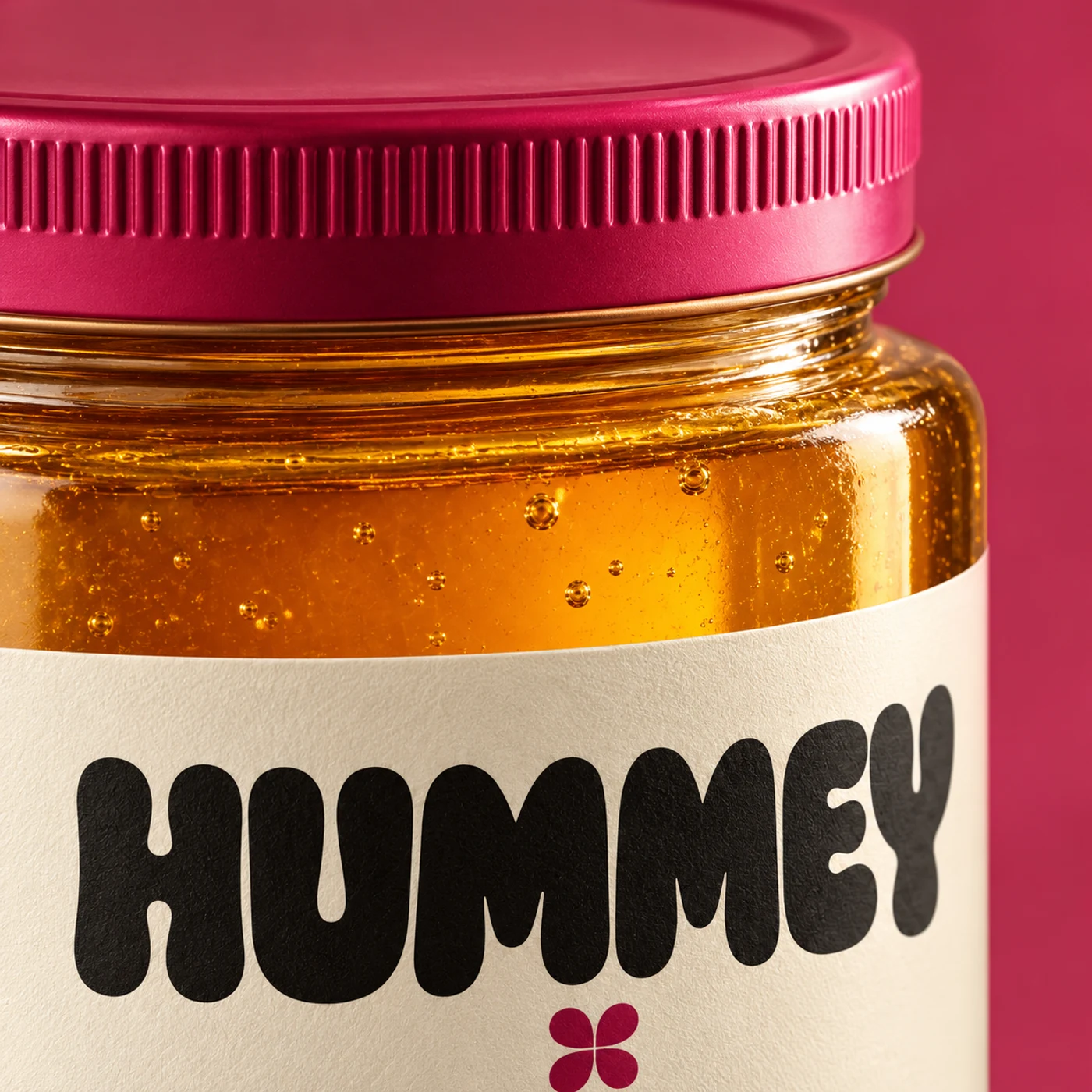
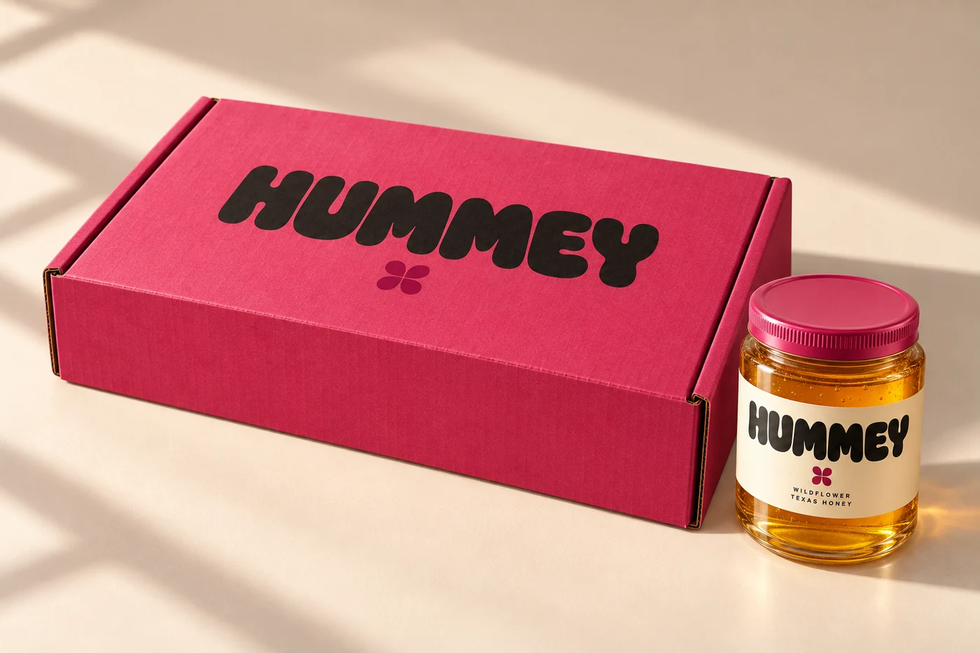
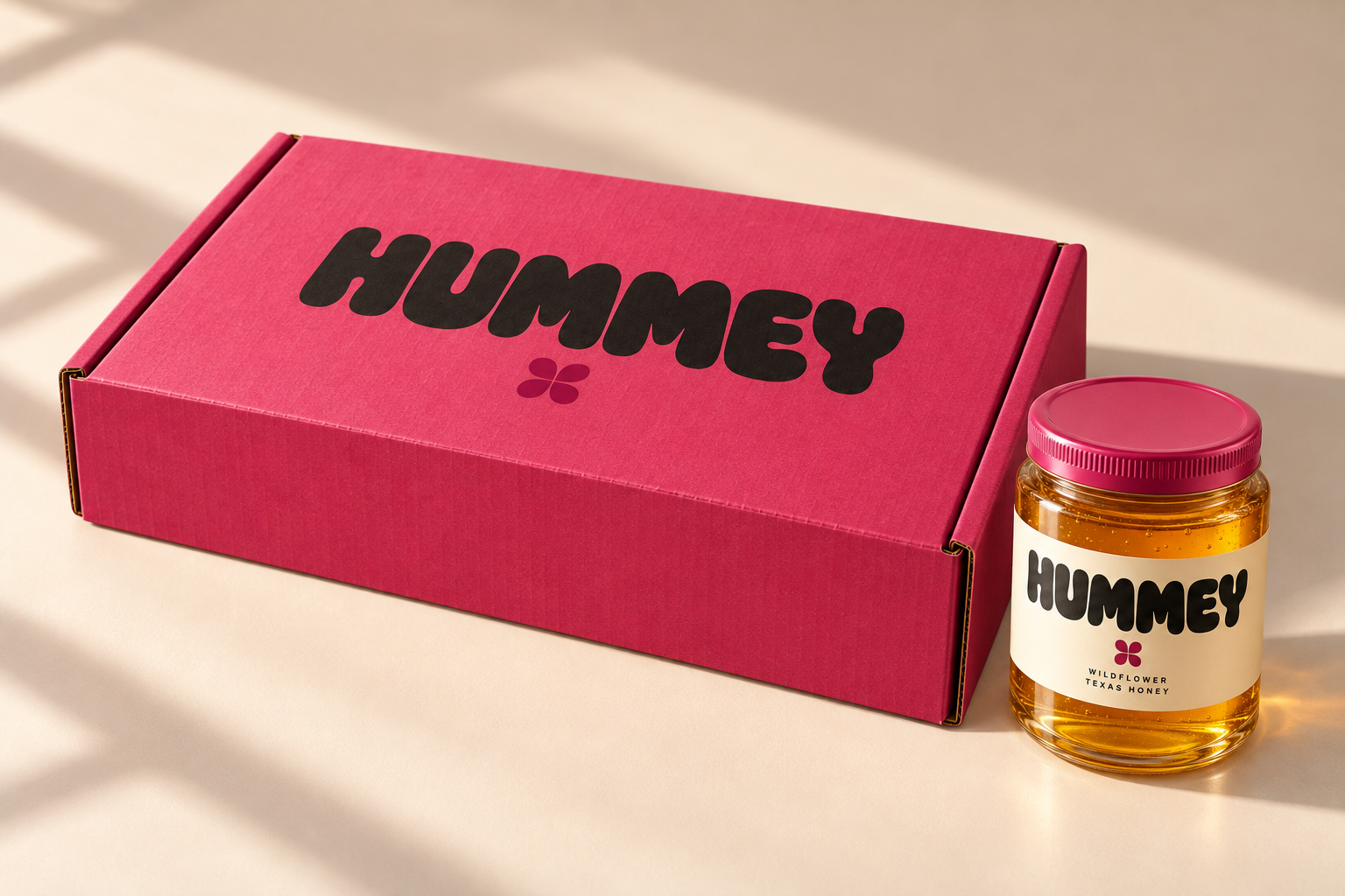
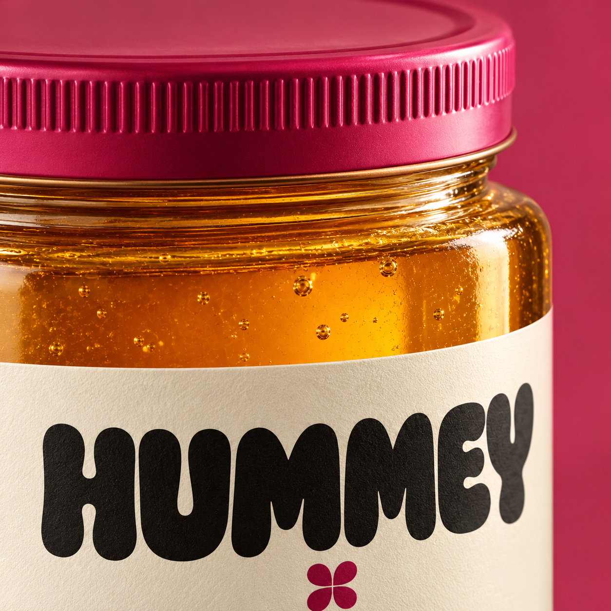
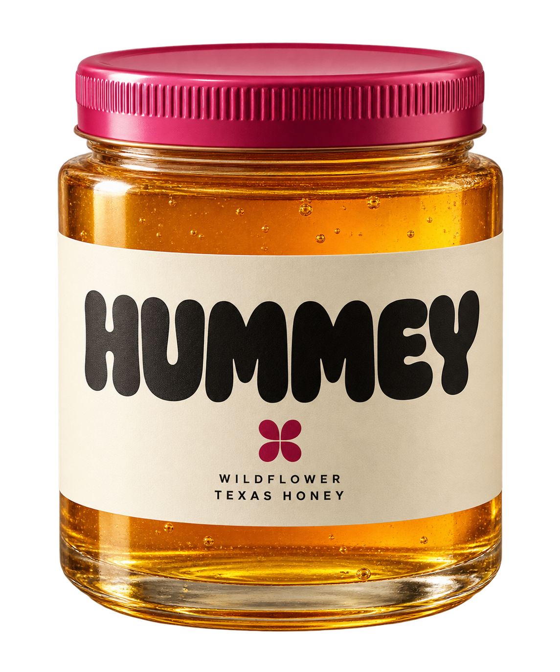
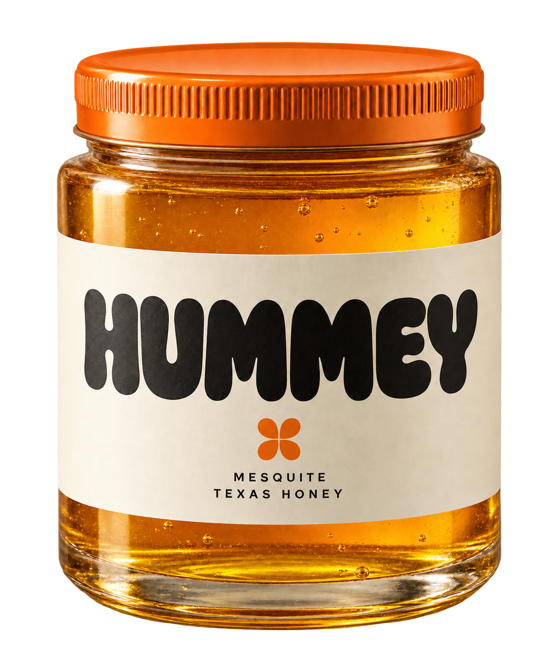
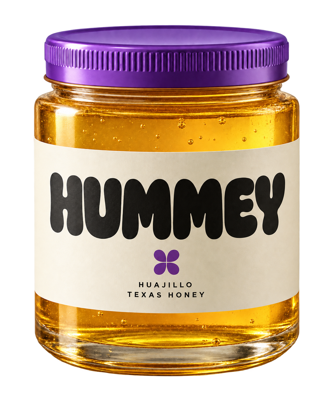
A consistent clear-glass silhouette, a cream paper wrap and a metal lid. Color identifies the varietal. The honey always stays a believable natural amber.
Good things
come in threes.
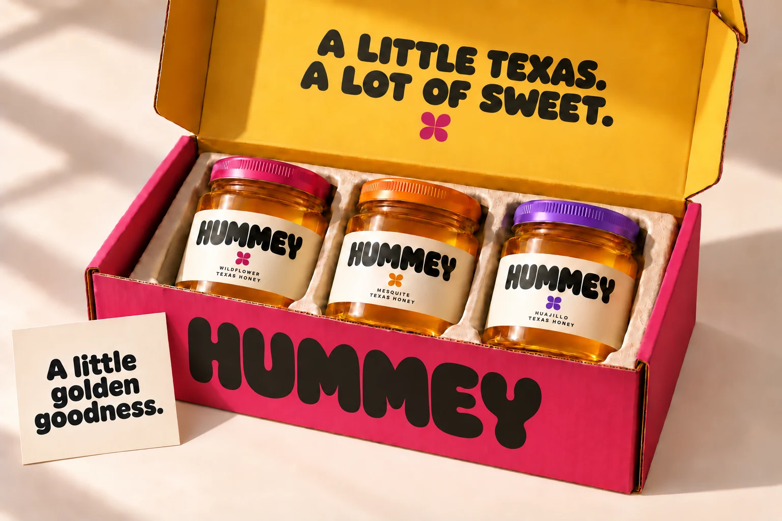
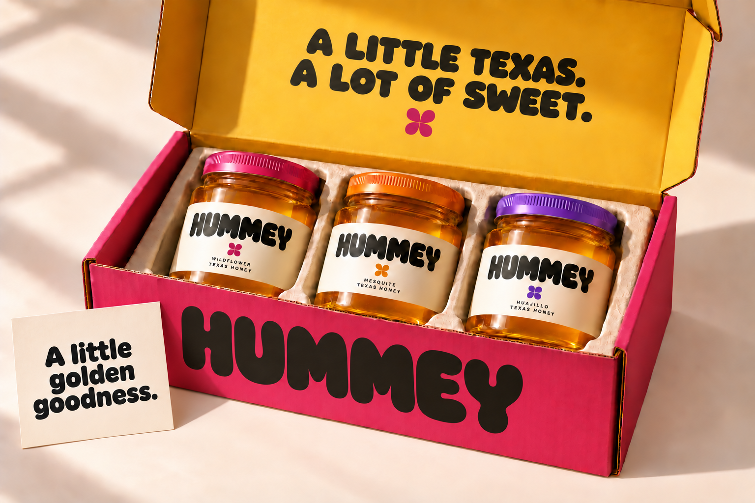
The trio travels in a raspberry outer mailer with a golden interior, three molded-pulp cavities and a cream insert card. The open and closed studies share the same construction and palette.
Sweet.
Never syrupy.
Short, confident and lightly mischievous. Speak about flavor, material and everyday use. No invented heritage, no health halo, no fake farm provenance.
One unmistakable material moment carries the motion: honey stretches slowly, resists and settles. Everything else makes choosing easier.
“A sweeter
start.”
“Nice shelf.
Needs honey.”